Published: Apr 2, 2020 by Petra
To create the figures in this post, we first need the data, which can be extracted (laboriously) from the press releases on the BC CDC website.
library(tidyverse)

daily_reports <- read_csv("BC_reports.csv", trim_ws = TRUE, na=c("","NA"))

head(daily_reports)
# A tibble: 6 x 12
  date       new_cases recov  died   VCH    FH   ISH   INH    NH  hosp    IC
  <date>         <dbl> <dbl> <dbl> <dbl> <dbl> <dbl> <dbl> <dbl> <dbl> <dbl>
1 2020-01-28         1     0     0     1     0     0     0     0     0     0
2 2020-02-04         1     0     0     2     0     0     0     0     0     0
3 2020-02-06         2     1     0     4     0     0     0     0     0     0
4 2020-02-14         1     0     0     4     0     0     1     0     0     0
5 2020-02-20         1     0     0     4     1     0     1     0     0     0
6 2020-02-24         1     0     0     4     2     0     1     0     0     0
# … with 1 more variable: self_isolation <dbl>
Data are organized by date, and includes the number of new cases announced each day, the number of newly recovered people each day, the number of new deaths each day, and then the number of new cases broken down by health region as well as some information about the number of people in hospital (for use in later posts).
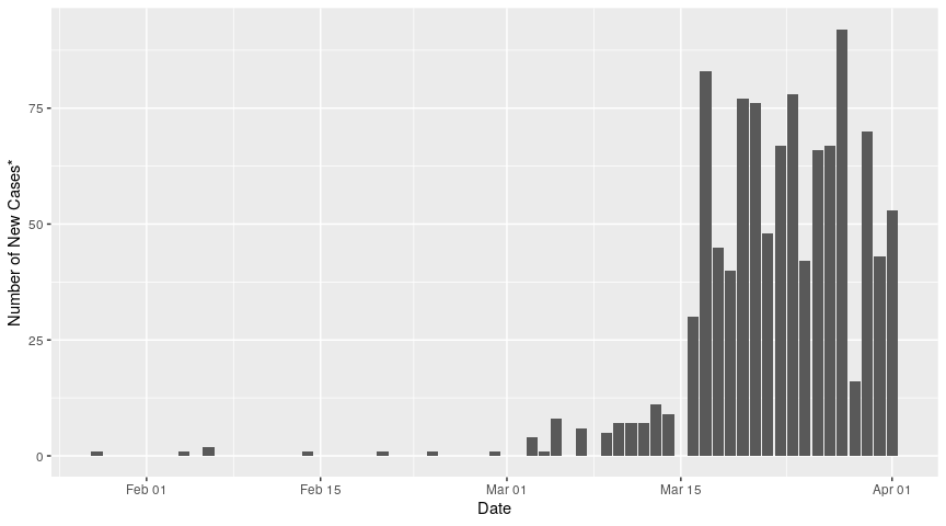
We can plot the number of new cases each day as a function of date:
ggplot(data = daily_reports, aes(x = date, y = new_cases))+
  geom_bar(stat="identity")+
  xlab("Date")+
  ylab("Number of New Cases*")
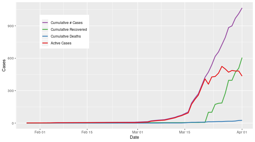
To calculate the cumulative number of cases of Covid-19 in BC, we can use the cumsum function. Be sure to replace NA values (gaps in the data) with 0s! We can then calculate the number of active cases for each day, by subtracting the cumulative number of recoveries and deaths from the cumulative number of cases
cum_drs <-
daily_reports %>%
  select(date, new_cases, recov, died) %>%
  mutate(recov = ifelse(is.na(recov), 0, recov),
         died = ifelse(is.na(died),0,died),
         cume_new_cases = cumsum(new_cases),
         cume_recov = cumsum(recov),
         cume_died = cumsum(died),
         actives = cume_new_cases - cume_recov - cume_died)
The end goal is to plot the cumulative new cases, recoveries, deaths, and the active cases on one plot, but we’re going to work our way up to that. First, we will convert the data to long form and convert the case categories to an ordered factor
cum_drs_long <-
cum_drs %>%
  select(contains("cume"), date, actives) %>%
  gather(key = cat, value = cases, -date) %>%
  mutate(cat = factor(cat, levels = c("cume_new_cases", "cume_recov", "cume_died","actives"), ordered = TRUE))
I want to use a colour brewer palette, but because I’m not including all my data at once, I should set the colours manually. I can do this by creating a named list. I’m also going to use nicer names for the categories in my legends, by storing them in a vector:
# colours
cat_colours <- rev(RColorBrewer::brewer.pal(4,"Set1"))
names(cat_colours) <- levels(cum_drs_long$cat)
# category names
cat_names <- c("Cumulative # Cases","Cumulative Recovered","Cumulative Deaths", "Active Cases")
I’ll start with just the cumulative number of cases:
cum_drs_long %>%
  filter(cat == "cume_new_cases") %>% # filter for cumulative number of cases
  ggplot(aes(x = date, y = cases))+
  geom_line(aes(colour = cat), size = 1)+ # line plot
  scale_colour_manual(values = cat_colours, label=cat_names)+ # recolour and rename the data
  xlab("Date")+
  ylab("Cases")+
  theme(legend.title = element_blank(),
        legend.position = c(0.1,0.9), # move the legend to inside the plot for consistent figure widths
        legend.justification = c(0,1))

Now I would like to add the recoveries to the graph
cum_drs_long %>%
  filter(cat == "cume_new_cases" | cat == "cume_recov") %>% # filter for new cases OR recovered
  ggplot(aes(x = date, y = cases))+
  geom_line(aes(colour = cat), size = 1)+
  scale_colour_manual(values = cat_colours, label=cat_names)+
  xlab("Date")+
  ylab("Cases")+
  theme(legend.title = element_blank(),
        legend.position = c(0.1,0.9),
        legend.justification = c(0,1))

Now I will add deaths
cum_drs_long %>%
  filter(grepl("cume", cat)) %>% # filter for cumulative cases, recoveries, and deaths
  ggplot(aes(x = date, y = cases))+
  geom_line(aes(colour = cat), size = 1)+
  scale_colour_manual(values = cat_colours,
                        label= cat_names)+
  xlab("Date")+
  ylab("Cases")+
  theme(legend.title = element_blank(),
        legend.position = c(0.1,0.9),
        legend.justification = c(0,1))
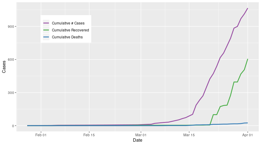
Finally, I use all data
cum_drs_long %>%
  ggplot(aes(x = date, y = cases))+
  geom_line(aes(colour = cat), size = 1)+
  scale_colour_manual(values = cat_colours,
                      labels = cat_names)+
  xlab("Date")+
  ylab("Cases")+
  theme(legend.title = element_blank(),
        legend.position = c(0.1,0.9),
        legend.justification = c(0,1))
All analyses performed in R V3.6.3