Published: Apr 23, 2020 by Petra
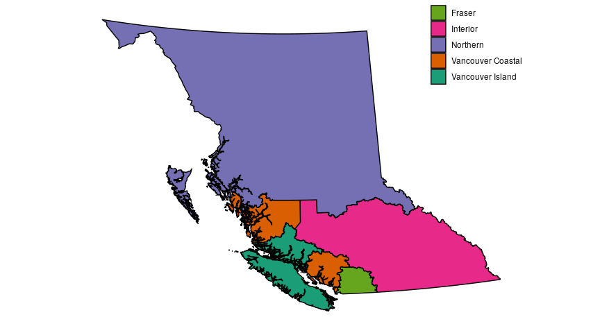
To make the figures in this post we need a couple different sets of data. To start, I’m going to make the map, using map data from this DataBC page, which is free to use and licensed under the Open Government Licence – British Columbia. The map data comes as a shapefile which is pretty standard and something we can deal with in R. I’m also going to manually set colours for the different regions, because while the defualt colours in R are okay, I like customizing my colours, typically with the colourbrewer scales, which is what I used in the previous post as well.
library(plyr)
library(tidyverse)
library(lubridate)
library(zoo)
library(scales)
library(rgdal)

# start with some labeling.
# Long names can be cumbersome during data manipulation, but their essential for when we label graphs

reg_labs <- c("Fraser", "Interior", "Northern", "Vancouver Coastal", "Vancouver Island")

# assign colours to the regions
reg_colours <- rev(RColorBrewer::brewer.pal(5,"Dark2"))
names(reg_colours) <- c("FH","INH","NH","VCH","VIH")

# make a tibble to store region names and their abbreviations

map_regions <-
  tibble(reg2 = c("FH", "INH", "NH", "VCH", "VIH"),
         HA_Name = c("Fraser", "Interior", "Northern", "Vancouver Coastal", "Vancouver Island"))

# read in the shapefile
health_regs <- readOGR(dsn = ".", layer = "HA_2018", verbose = FALSE)
# dsn = "." tells the function to look here in our local directory (assuming you saved your shapefile in your local directory)
# layer = "HA_2018" is the name of the shapefile, without the file extension
# verbose = false because I don't really care about seeing a progress bar as I've wandered away for another cup of coffee

# the result is a SpatialPolygonDataFrame, which we can't plot with ggplot, we need to convert this to a data frame

# we start by adding an extra id column to the SPDF
health_regs@data$id <- rownames(health_regs@data)

# then we convert the SPDF to a dataframe using fortify
# we tell fortify to use the id column that we created as our regions (this is essentially a grouping variable)
health.points <- fortify(health_regs, region = "id")

# we now have a dataframe that has all of the gps coordinates that were in the SPDF, but none of the metadata (region name, etc)

head(health.points)
     long      lat order  hole piece id group
1 1371177 901822.6     1 FALSE     1  0   0.1
2 1371321 901542.9     2 FALSE     1  0   0.1
3 1371841 901767.9     3 FALSE     1  0   0.1
4 1371870 901748.9     4 FALSE     1  0   0.1
5 1371930 901667.8     5 FALSE     1  0   0.1
6 1371969 901669.0     6 FALSE     1  0   0.1
# to get that info, we use the id column we created to merge the new dataframe with the metadata part of the SPDF
health_df <- join(health.points, health_regs@data, by = "id")

# add region abbreviations to this new dataframe
health_df <-
health_df %>%
  left_join(map_regions)


# when plotting maps, we need to tell ggplot how to scale the map correctly otherwise it will just be plotted as a square
# we could tell ggplot how we want the map to be projected using a model like mercator etc. but this is good enough for what I want to do
map_ratio <- (max(health_df$lat) - min(health_df$lat))/(max(health_df$long)-min(health_df$long))

ggplot()+
  geom_polygon(data = health_df, aes(x = long, y = lat, group = group, fill = reg2), colour = "black") +
  coord_fixed(ratio = map_ratio) +
  scale_fill_manual(name = "Health Region",
                    values = reg_colours,
                    labels = reg_labs)+
  theme(axis.title = element_blank(),
        axis.text = element_blank(),
        legend.position = c(0.9, 0.9),
        axis.ticks = element_blank(),
        panel.background = element_blank())
Now let’s look at case numbers from each region, using the joint statements from from the Ministry of Health that are released just about every day.
daily_reports <- read_csv("BC_reports.csv", trim_ws = TRUE, na=c("","NA"))

daily_reports
# A tibble: 80 x 12
   date       new_cases recov  died   VCH    FH   VIH   INH    NH  hosp    IC
   <date>         <dbl> <dbl> <dbl> <dbl> <dbl> <dbl> <dbl> <dbl> <dbl> <dbl>
 1 2020-01-28         1     0     0     1     0     0     0     0     0     0
 2 2020-02-04         1     0     0     2     0     0     0     0     0     0
 3 2020-02-06         2     1     0     4     0     0     0     0     0     0
 4 2020-02-14         1     0     0     4     0     0     1     0     0     0
 5 2020-02-20         1     0     0     4     1     0     1     0     0     0
 6 2020-02-24         1     0     0     4     2     0     1     0     0     0
 7 2020-02-29         1     3     0     5     2     0     1     0     0     0
 8 2020-03-03         4     0     0     8     3     0     1     0     0     0
 9 2020-03-04         1     0     0     9     3     0     1     0     1     1
10 2020-03-05         8     0     0    15     5     0     1     0     1     1
# … with 70 more rows, and 1 more variable: self_isolation <dbl>
Let’s start with just the cumulative cases, which we can do with these data. There are some gaps in this data, which I think are important to visualize. We can do this by linearly interpolating between the data points that we do have, and then plotting these interpolated data with dashed lines to indicate that they aren’t reported numbers. In order to do this, we need to flesh out our data to include the rows (dates) that are missing data, select the dates that bracket these gaps, and interpolate the data between these brackets.
# select just the regional data and convert to long form

reg_reports <-
daily_reports %>%
  select(date, contains("H", ignore.case = FALSE)) %>%
  gather(key = region, value = cume_cases, -date)

reg_reports
# A tibble: 400 x 3
   date       region cume_cases
   <date>     <chr>       <dbl>
 1 2020-01-28 VCH             1
 2 2020-02-04 VCH             2
 3 2020-02-06 VCH             4
 4 2020-02-14 VCH             4
 5 2020-02-20 VCH             4
 6 2020-02-24 VCH             4
 7 2020-02-29 VCH             5
 8 2020-03-03 VCH             8
 9 2020-03-04 VCH             9
10 2020-03-05 VCH            15
# … with 390 more rows
# store the most recent date of the data we have

most_recent <-
reg_reports %>%
  select(date) %>%
  pull() %>%
  max(.) %>%
  as_date()

# store the length of time between the earliest date for which we don't have data, and the most recent date

fill_dates_length <- 1 + interval(as_date("2020-03-13"),most_recent) %/% ddays(1)

# create a dataframe with the full complement of dates and regions and join with our reported data
# this creates the rows where we are missing data
reg_reports_full <-
tibble(date = rep(seq(as_date("2020-03-13"), most_recent, by = "day"),5),
       region = rep(c("FH","INH","NH","VCH","VIH"), each = fill_dates_length)) %>%
  left_join(reg_reports)

reg_reports_full
# A tibble: 355 x 3
   date       region cume_cases
   <date>     <chr>       <dbl>
 1 2020-03-13 FH             18
 2 2020-03-14 FH             NA
 3 2020-03-15 FH             NA
 4 2020-03-16 FH             NA
 5 2020-03-17 FH             47
 6 2020-03-18 FH             58
 7 2020-03-19 FH             81
 8 2020-03-20 FH             95
 9 2020-03-21 FH            126
10 2020-03-22 FH            150
# … with 345 more rows
# we can now identify the gaps in the data
gaps <-
reg_reports_full %>%
  mutate(rownum = 1:NROW(reg_reports_full)) %>%
  filter(is.na(cume_cases)) %>%
  pull(rownum)

# for each row in the full data set that is missing case numbers, store that row number and the one before and after
gap_brack <- vector()
for(i in 1:length(gaps)){
  gap_brack <- c(gap_brack, gaps[i]-1, gaps[i], gaps[i] + 1)
}

# keep the unique values (remove extras due to multiple rows missing data)
gap_brack <- unique(gap_brack)

# now we can select the rows that we need to interpolate for, and perform the interpolation
reg_reports_gap <-
reg_reports_full %>%
  mutate(rownum = 1:NROW(reg_reports_full)) %>%
  filter(rownum %in% gap_brack) %>%
  mutate(cume_cases = na.approx(cume_cases)) %>%
  select(-rownum)

reg_reports_gap
# A tibble: 160 x 3
   date       region cume_cases
   <date>     <chr>       <dbl>
 1 2020-03-13 FH           18
 2 2020-03-14 FH           25.2
 3 2020-03-15 FH           32.5
 4 2020-03-16 FH           39.8
 5 2020-03-17 FH           47
 6 2020-03-22 FH          150
 7 2020-03-23 FH          172
 8 2020-03-24 FH          194
 9 2020-03-28 FH          291
10 2020-03-29 FH          307
# … with 150 more rows
# in order for this to plot well, we need to add the dates for which we do have data to the interpolated data tibble
# but we don't want the real data in this tibble, because if it is included, it will appear in the plot as interpolated data
# we create the full complement of dates and regions again, and merge our interpolated data onto it
reg_reports_gap <-
tibble(date = rep(seq(as_date("2020-03-13"), most_recent, by = "day"),5),
       region = rep(c("FH","INH","NH","VCH","VIH"), each = fill_dates_length)) %>%
  left_join(reg_reports_gap)

reg_reports_gap
# A tibble: 355 x 3
   date       region cume_cases
   <date>     <chr>       <dbl>
 1 2020-03-13 FH           18
 2 2020-03-14 FH           25.2
 3 2020-03-15 FH           32.5
 4 2020-03-16 FH           39.8
 5 2020-03-17 FH           47
 6 2020-03-18 FH           NA
 7 2020-03-19 FH           NA
 8 2020-03-20 FH           NA
 9 2020-03-21 FH           NA
10 2020-03-22 FH          150
# … with 345 more rows
# bind the reported and interpolated data together, labelling them as such with a new column (type)
reg_reports_all <-
bind_rows(reg_reports %>%
            add_column(type = "repo"),
          reg_reports_gap %>%
            add_column(type = "inter"))

# plot
ggplot(data = reg_reports_all, aes(x = date, y = cume_cases))+
  geom_line(aes(colour = region, linetype = type, size = type))+ # set linetype based on data type
  scale_linetype_manual(name = "Data type", values = c("dotted", "solid"), labels = c("Interpolated", "Reported"))+
  scale_size_manual(name = "Data type", values = c(0.5, 1), labels = c("Interpolated", "Reported"))+
  scale_colour_manual(name = "Health Region", values = reg_colours, labels = reg_labs)+ # set colours using our predifined vectors
  xlab("Date")+
  ylab("Cumulative # of Cases")+
  ylim(0,710)+
  theme(legend.position = c(0.15, 0.6))

Now we can move on to recoveries, deaths and active cases in each region. For this we need the data from the BC CDC’s summary reports. Again, we can interpolate the missing data for each region and each case category
reg_details <- read_csv("reg_details.csv", trim_ws = TRUE, na = c("","NA"))

reg_details
# A tibble: 495 x 11
   date       category Fraser Interior `Vancouver Isla… Northern
   <date>     <chr>     <dbl>    <dbl>            <dbl>    <dbl>
 1 2020-03-23 Total n…    163       40               44        6
 2 2020-03-23 Median …     52       47               45       65
 3 2020-03-23 Female …     80       20               25        4
 4 2020-03-23 Ever ho…     36        5                4        0
 5 2020-03-23 Median …     73       53               66       NA
 6 2020-03-23 Ever ICU      7        2                2        0
 7 2020-03-23 Median …     73       39               66       NA
 8 2020-03-23 Total n…      2        0                0        0
 9 2020-03-23 Median …     83       NA               NA       NA
10 2020-03-23 Recover…      2        8                0        0
# … with 485 more rows, and 5 more variables: `Vancouver Coastal` <dbl>,
#   total <dbl>, range <chr>, n <dbl>, comments <chr>
# the categories column has long strings, which is inconvenient to work with when manipulating data
# I've created abbreviatons for these categories in a separate csv

cat_labs <- read_csv("cat_labs.csv", trim_ws = TRUE, na = c("","NA"))

cat_labs
# A tibble: 15 x 2
   category                                    cat
   <chr>                                       <chr>
 1 Total number of cases                       cume_cases
 2 Number of new cases since yesterday         new_cases
 3 Median age in years, cases                  med_age_all
 4 Female sex, cases                           fem_cases
 5 Ever hospitalized                           cume_hosp
 6 Median age in years, ever hospitalized      med_age_hosp
 7 Ever ICU                                    cume_icu
 8 Median age in years, ICU admission          med_age_icu
 9 Total number of deaths                      cume_died
10 Median age in years, deaths                 med_age_died
11 Recovered                                   cume_recov
12 Cumulative incidence per 100,000 population cume_per_cap
13 Currently hospitalized                      hosp
14 Currently in critical care                  crit_care
15 New deaths since yesterday                  new_deaths
# add the labels
reg_details <-
reg_details %>%
  left_join(cat_labs)

# calculate the number of active cases by subtracting cumulative recoveries and deaths from cumulative cases

reg_actives <-
reg_details %>%
  filter(cat == "cume_cases" | cat == "cume_recov" | cat == "cume_died") %>% # filter just the data we want
  select(-total, -range, -n, -comments, -category) %>% # select just the columns we need
  gather(key = reg, value = n, -date, -cat) %>% # convert to long form
  spread(key = cat, value = n) %>% # convert back to wide form, this time with case types as columns
  mutate(active = cume_cases - cume_recov - cume_died) %>% # calculate actives
  left_join(map_regions, by = c("reg" = "HA_Name")) # add region abbreviations

reg_actives
# A tibble: 210 x 7
   date       reg               cume_cases cume_died cume_recov active reg2
   <date>     <chr>                  <dbl>     <dbl>      <dbl>  <dbl> <chr>
 1 2020-03-23 Fraser                   163         2          2    159 FH
 2 2020-03-23 Interior                  40         0          8     32 INH
 3 2020-03-23 Northern                   6         0          0      6 NH
 4 2020-03-23 Vancouver Coastal        286        11        136    139 VCH
 5 2020-03-23 Vancouver Island          44         0          0     44 VIH
 6 2020-03-24 Fraser                   194         2          3    189 FH
 7 2020-03-24 Interior                  41         0          8     33 INH
 8 2020-03-24 Northern                   8         0          4      4 NH
 9 2020-03-24 Vancouver Coastal        330        11        158    161 VCH
10 2020-03-24 Vancouver Island          44         0          0     44 VIH
# … with 200 more rows
# store the most recent date
most_recent2 <-
reg_details %>%
  select(date) %>%
  pull() %>%
  max(.) %>%
  as_date()

# store the length of the interval between the earliest and latest dates in the set
fill_dates_length2 <- 1 + interval(as_date("2020-03-23"),most_recent2) %/% ddays(1)

# create the full complement of dates and regions to create the rows that we're missing
# join with the existing date
reg_reports_full2 <-
tibble(date = rep(seq(as_date("2020-03-23"), most_recent2, by = "day"),5),
       reg2 = rep(c("FH","INH","NH","VCH","VIH"), each = fill_dates_length2)) %>%
  left_join(reg_actives)

reg_reports_full2
# A tibble: 305 x 7
   date       reg2  reg    cume_cases cume_died cume_recov active
   <date>     <chr> <chr>       <dbl>     <dbl>      <dbl>  <dbl>
 1 2020-03-23 FH    Fraser        163         2          2    159
 2 2020-03-24 FH    Fraser        194         2          3    189
 3 2020-03-25 FH    Fraser        218         2          3    213
 4 2020-03-26 FH    Fraser        241         2          5    234
 5 2020-03-27 FH    Fraser        262         2         90    170
 6 2020-03-28 FH    <NA>           NA        NA         NA     NA
 7 2020-03-29 FH    <NA>           NA        NA         NA     NA
 8 2020-03-30 FH    Fraser        323         2        147    174
 9 2020-03-31 FH    Fraser        348         3        163    182
10 2020-04-01 FH    Fraser        367         4        176    187
# … with 295 more rows
# most regions have the same gaps, but Vancouver Coastal, for whatever reason, is missing more data
# to compensate, we can do the interpolation with the other regions first

# remove Vancouver coastal
# identify gaps
gaps2 <-
reg_reports_full2 %>%
  filter(reg2 != "VCH") %>%
  mutate(rownum = 1:NROW(.)) %>%
  filter(is.na(cume_cases)) %>%
  pull(rownum)

# for each gap in the data (row with missing data), store that row and the one before and after
gap_brack2 <- vector()
for(i in 1:length(gaps2)){
  gap_brack2 <- c(gap_brack2, gaps2[i]-1, gaps2[i], gaps2[i] + 1)
}

# store just unique values
gap_brack2 <- unique(gap_brack2)

# perform the interpolation
reg_reports_gap2 <-
reg_reports_full2 %>%
  filter(reg2 != "VCH") %>%
  mutate(rownum = 1:NROW(.)) %>%
  filter(rownum %in% gap_brack2) %>%
  mutate(cume_cases = na.approx(cume_cases),
         cume_recov = na.approx(cume_recov),
         active = na.approx(active),
         cume_died = na.approx(cume_died)) %>%
  select(-rownum) %>%
  left_join(map_regions, by = c("reg2" = "reg2")) %>%
  select(-reg) %>%
  rename(., reg = HA_Name)

# Now do vancouver coastal

gaps3 <-
reg_reports_full2 %>%
  filter(reg2 == "VCH") %>%
  mutate(rownum = 1:NROW(.)) %>%
  filter(is.na(active)) %>%
  pull(rownum)

gap_brack3 <- vector()
for(i in 1:length(gaps3)){
  gap_brack3 <- c(gap_brack3, gaps3[i]-1, gaps3[i], gaps3[i] + 1)
}

gap_brack3 <- unique(gap_brack3)

reg_reports_gap3 <-
reg_reports_full2 %>%
  filter(reg2 == "VCH") %>%
  mutate(rownum = 1:NROW(.)) %>%
  filter(rownum %in% gap_brack3) %>%
  mutate(cume_cases = na.approx(cume_cases),
         cume_recov = na.approx(cume_recov),
         active = na.approx(active),
         cume_died = na.approx(cume_died)) %>%
  select(-rownum) %>%
  left_join(map_regions, by = c("reg2" = "reg2")) %>%
  select(-reg) %>%
  rename(reg = HA_Name)

#combine

reg_reports_gap2 <-
  bind_rows(reg_reports_gap2,
            reg_reports_gap3)

# add in the empty dates

reg_reports_gap2 <-
tibble(date = rep(seq(as_date("2020-03-23"), most_recent2, by = "day"),5),
       reg2 = rep(c("FH","INH","NH","VCH","VIH"), each = fill_dates_length2)) %>%
  left_join(reg_reports_gap2)

# put the reported data and interpolated data together in a single data frame

reg_reports_all2 <-
bind_rows(reg_reports_full2 %>%
            left_join(map_regions, by = c("reg2" = "reg2")) %>%
            select(-reg) %>%
            rename(reg = HA_Name) %>%
            add_column(type = "repo"),
          reg_reports_gap2 %>%
            left_join(map_regions, by = c("reg2" = "reg2")) %>%
            select(-reg) %>%
            rename(reg = HA_Name) %>%
            add_column(type = "inter"))

reg_reports_all2
# A tibble: 610 x 8
   date       reg2  cume_cases cume_died cume_recov active reg    type
   <date>     <chr>      <dbl>     <dbl>      <dbl>  <dbl> <chr>  <chr>
 1 2020-03-23 FH           163         2          2    159 Fraser repo
 2 2020-03-24 FH           194         2          3    189 Fraser repo
 3 2020-03-25 FH           218         2          3    213 Fraser repo
 4 2020-03-26 FH           241         2          5    234 Fraser repo
 5 2020-03-27 FH           262         2         90    170 Fraser repo
 6 2020-03-28 FH            NA        NA         NA     NA Fraser repo
 7 2020-03-29 FH            NA        NA         NA     NA Fraser repo
 8 2020-03-30 FH           323         2        147    174 Fraser repo
 9 2020-03-31 FH           348         3        163    182 Fraser repo
10 2020-04-01 FH           367         4        176    187 Fraser repo
# … with 600 more rows
# so here, we could use the care labels that we imported at the beginning (cat_labs)
# but I want even shorter labels than what is in the original data
# so I add my own labels, manually, and order them as a factor so that the figure legend is ordered the way I want it to be
# ggplot2 will otherwise order legend entries alphabetically
rra2_long <-
reg_reports_all2 %>%
  gather(key = cases, value = ntot, -date, -reg2, -reg, -type) %>%
  mutate(case_type = factor(ifelse(cases == "cume_died", "Cumulative Deaths",
                                   ifelse(cases == "cume_recov", "Cumulative Recoveries",
                                          ifelse(cases == "active", "Active Cases", "Cumulative Cases"))),
                            levels = c("Cumulative Cases", "Cumulative Recoveries", "Cumulative Deaths", "Active Cases"),
                            ordered = TRUE))

rra2_long
# A tibble: 2,440 x 7
   date       reg2  reg    type  cases       ntot case_type
   <date>     <chr> <chr>  <chr> <chr>      <dbl> <ord>
 1 2020-03-23 FH    Fraser repo  cume_cases   163 Cumulative Cases
 2 2020-03-24 FH    Fraser repo  cume_cases   194 Cumulative Cases
 3 2020-03-25 FH    Fraser repo  cume_cases   218 Cumulative Cases
 4 2020-03-26 FH    Fraser repo  cume_cases   241 Cumulative Cases
 5 2020-03-27 FH    Fraser repo  cume_cases   262 Cumulative Cases
 6 2020-03-28 FH    Fraser repo  cume_cases    NA Cumulative Cases
 7 2020-03-29 FH    Fraser repo  cume_cases    NA Cumulative Cases
 8 2020-03-30 FH    Fraser repo  cume_cases   323 Cumulative Cases
 9 2020-03-31 FH    Fraser repo  cume_cases   348 Cumulative Cases
10 2020-04-01 FH    Fraser repo  cume_cases   367 Cumulative Cases
# … with 2,430 more rows
# there are two points in the data set that I want to highlight with asterisks, cumulative recoveries in Vancouver coastal on 2020-03-26 and 2020-04-17

marker <-
tibble(date = c(ymd("2020-03-26"),ymd("2020-04-17")),
       ntot = c(175,460),
       case_type = c("Cumulative Recoveries","Cumulative Recoveries")) %>%
         mutate(case_type = factor(case_type, levels = c("Cumulative Cases", "Cumulative Recoveries", "Cumulative Deaths", "Active Cases"), ordered = TRUE))


# Lastly, there are a couple spots in the data where we have a single day of data and then gaps on either side
# when we plot the reported data as a line graph, these single days will not appear
# because they are isolated and there are no adjacent points to draw lines with
# we can plot these isolated days as points as a work-around
# I identify these single points by looking at the gap data
# I calculate the difference between dates between each consequtive pair of rows
# if the difference is equal to two days (ie there is a day with data between them)
# I select the later gap date and convert it back to the date with data
# then use left join to select the correct data
max_date <-
  rra2_long %>%
  select(date) %>%
  pull() %>%
  unique() %>%
  max(.)


extra_dates <-
  bind_rows(rra2_long %>%
              filter(type == "repo" & is.na(ntot)) %>% # filter data to return just reported NAs (gaps)
              mutate(date2 = c(NA,diff(date) == 2)) %>%
              filter(date2 == TRUE) %>%
              select(date, reg2, cases, type) %>%
              mutate(date = date - 1) %>%
              left_join(rra2_long),
            rra2_long %>%
              filter(date == max_date)) # I also add on the data from the latest date in the dataset, in case those data are also isolated

# I store the earliest date to use when plotting
min_date <-
rra2_long %>%
  select(date) %>%
  pull() %>%
  unique() %>%
  min(.)

ggplot(data = rra2_long, aes(x = date, y = ntot))+
  geom_line(aes(colour = reg2, linetype = type, size = type))+ # plot the reported and interpolated data as lines
  geom_point(data = extra_dates, aes(x = date, y = ntot, colour = reg2), size = 1, shape = 15, show.legend = FALSE)+ # add the single points
  geom_point(data = marker, aes(x = date, y = ntot), size = 2, shape = 8)+ # add the asterisks
  scale_linetype_manual(name = "Data type", values = c("dotted", "solid"), labels = c("Interpolated", "Reported"))+
  scale_size_manual(name = "Data type", values = c(0.5, 1), labels = c("Interpolated", "Reported"))+
  scale_colour_manual(name = "Health Region", values = reg_colours, labels = reg_labs)+
  xlab("Date")+
  ylab("# of Cases")+
  xlim(c(min_date, max_date))+
  facet_wrap(.~case_type, ncol = 2) +
  ylim(0,710)+
  theme(legend.position = c(0.15, 0.3))

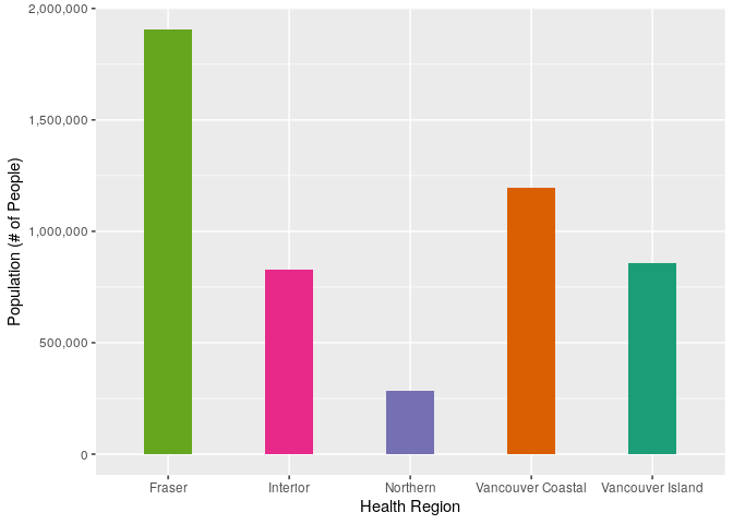
To standardize the case counts by population size, we can use the population data for each health region, which is accessible through BCStats. These data are from 2019, which is good enough for our purposes, I don’t imagine they have changed too much since they were collected. These data are freely available and licensed under the Open Government Licence - British Columbia.
reg_pops <- read_csv("reg_pops.csv", trim_ws = TRUE, na = c("","NA"))

reg_pops
# A tibble: 21 x 6
   cat       VCH      FH    VIH    INH     NH
   <chr>   <dbl>   <dbl>  <dbl>  <dbl>  <dbl>
 1 total 1193977 1906933 858785 827314 284327
 2 LT1      9712   18235   6309   6242   2821
 3 1-4     37080   76749  28444  27985  13541
 4 5-9     45685  103394  38095  37617  17012
 5 10-14   47237  104134  37736  38785  16765
 6 15-19   59437  118823  41359  40893  16610
 7 20-24   83956  140014  48691  44520  19350
 8 25-29  103969  130330  50655  47787  21280
 9 30-34  104423  135970  53600  51021  21097
10 35-39   89466  136240  54701  51748  19570
# … with 11 more rows
# we may did into population structure later, for now we just want totals

reg_tots <-
reg_pops %>%
  slice(1) %>%
  select(-cat) %>%
  gather(key = region, value = pop_tot)

ggplot(data = reg_tots, aes(x = region, y = pop_tot))+
  geom_bar(stat = "identity", aes(fill = region), width = 0.4) +
  scale_x_discrete(name = "Health Region", labels = reg_labs) +
  scale_y_continuous(name = "Population (# of People)", labels = comma) +
  scale_fill_manual(values = reg_colours, guide = FALSE)
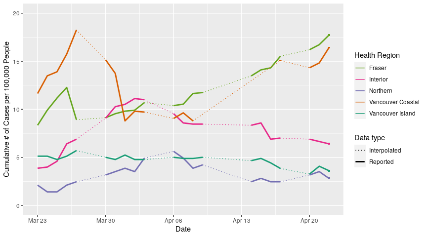
Let’s see what case numbers look like when we convert them to cases per 100,000. I chose 100,000 instead of 10,000 or 1 million because that gives us some “nice numbers” in the range of 0-20 people per 100,000.
per_cap_actives <- # save plot
reg_reports_all2 %>%
  left_join(reg_tots, by = c("reg2" = "region")) %>% # left join the population date onto our dataframe
  mutate(per_cap = 100000*active/pop_tot) %>% # calculate cases per 100,000
  ggplot(aes(x = date, y = per_cap))+ # plot
  geom_line(aes(colour = reg2, linetype = type, size = type))+
  scale_linetype_manual(name = "Data type", values = c("dotted", "solid"), labels = c("Interpolated", "Reported"))+
  scale_size_manual(name = "Data type", values = c(0.5, 1), labels = c("Interpolated", "Reported"))+
  scale_colour_manual(name = "Health Region", values = reg_colours, labels = reg_labs)+
  xlab("Date")+
  ylim(0,20)+
  ylab("Cumulative # of Cases per 100,000 People")

# repeat the process for our single data points
extra_dates_actives <-
extra_dates %>%
  left_join(reg_tots, by = c("reg2" = "region")) %>%
  mutate(per_cap = 100000*ntot/pop_tot) %>%
  filter(cases == "active")

per_cap_actives + # add the single data points to the plot
  geom_point(data = extra_dates_actives, aes(x = date, y = per_cap, colour = reg2),
             size = 1, shape = 15, show.legend = FALSE)
All analyses performed in R V3.6.3
This post is back-dated to 23 April 2020 but appeared online 25 May 2020