Published: Apr 2, 2020 by Petra

The above meme is a pretty accurate representation of what happens in my house when Dr. Bonnie Henry, BC’s Provincial Health Officer, comes on the news. But unfortunately, I’m beginning to feel a bit like this:

Which isn’t to say I don’t appreciate the status reports and updates from Dr. Henry and BC Minister of Health Adrian Dix; transparency from our government is an absolute necessity at any time, and especially so during a crisis. But without visualizations, the numbers start to blur together; how many new cases today? Was that more or less than yesterday? What did she just say about patients in hospitals? What did he just say about recoveries?
The BC CDC has a lot of information for the public regarding Covid-19, including a page with case counts and press releases. The situation reports are quite interesting and I suggest you check them out, but they don’t show me exactly what I want to see, which is a graph with the active number of cases. Conveniently, press releases about the pandemic dating back to January can be found on the same page and contain the relevant data, so I did a little reading, got the data into some tables, and started graphing.
Lets start with the number of new cases reported each day, which is usually the first thing Dr. Henry tells us:
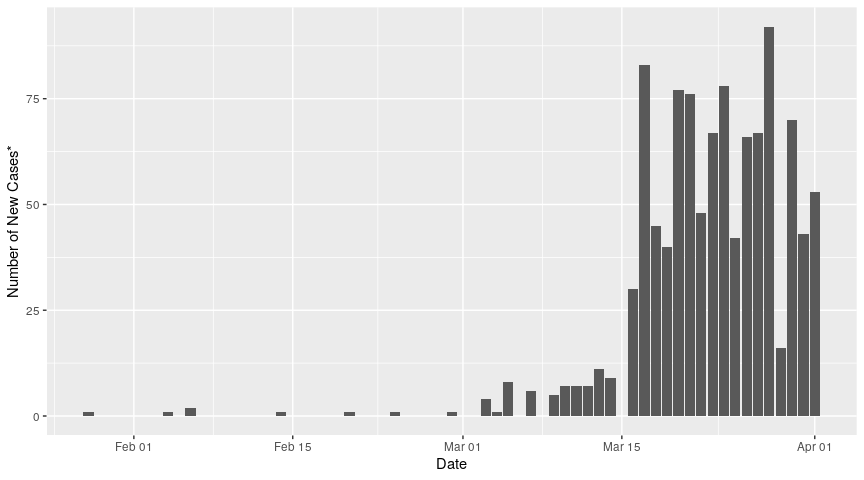 *Earlier press releases, when only one or two new cases were being announced per day, made the distinction between confirmed and presumptive cases; I didn't find any indication that a presumed case was later not confirmed, so I don't make a disctinction between presumed and confirmed cases here
As noted in the press release for March 17th, the large jump in number of new cases that day is largely due to a consolidation of data as “[the] reporting process aligns with the increase in number of tests… taking place in five sites around the province”. I’m not entirely sure what that means from a data collection perspective, but as predicted in that press release, the daily number of new cases did level off.
Okay cool, we’ve got the number of new cases for each day since the first reported case. Now, how do these numbers add up? Let’s look at the accumulation of cases, or the total number of cases identified since the first case all the way back in January:
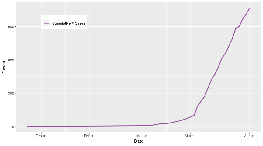
So what starts off as a pretty shallow increase really started to take off after March 15th, which coincides with that big jump in number of new cases on March 17th when the data consolidation took place. Since the number of new cases reported each day did level off but hasn’t consistently declined, the curve for cumulative number of cases remains steep. If all of the people who have tested positive for Covid-19 became sick and stayed sick, this would be an absolutely terrifying graph, but thankfully people have recovered, and a decent number of them too:
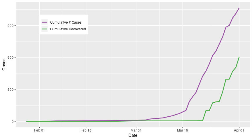
It’s tough to see here but in fact some of the first people to test positive for the virus recovered very quickly. Recoveries really start to take off around March 22 when it was reported that a total of 94 people had recovered. After that, there are a few blips, but the number of people recovered keeps climbing.
The next component of the affected population to add to this graph is the people who sadly never recovered:
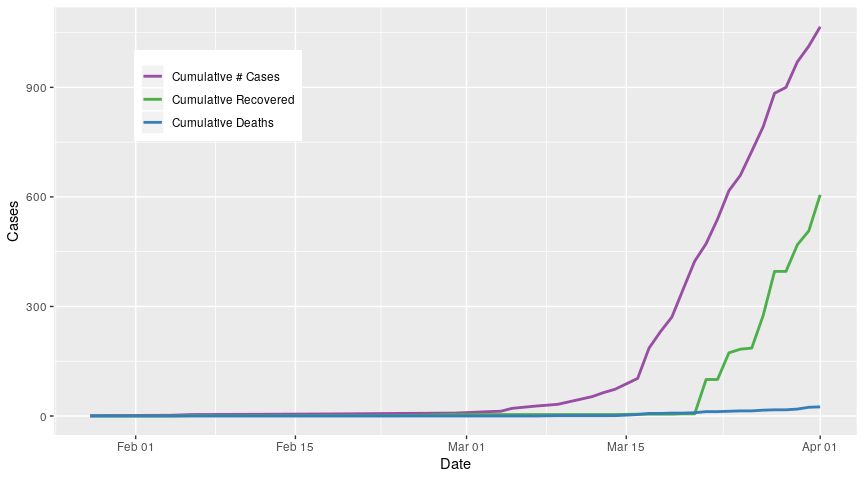
This line is currently very flat, but as the virus spreads through the population, we will see additional deaths. The important thing to note is that the number of cases, number of recovered, and number of deaths are cumulative; these lines are only ever going to increase as more people become infected, more people recover, and unfortunately, more people die.
So, we’ve got the total number of people who have been infected ever (purple curve), the total number of people who have recovered (green curve) and the total number of people who have died (blue curve). If we subtract the green curve and blue curve from the purple curve, we can see how many people are currently infected on any given day:
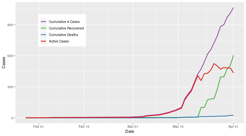
And here we are. The red line is the number of active cases, and we can clearly see the trend that Dr. Henry mentioned on March 27, where the curve appears to be flattening. This is due to two things. First, Dr. Henry reported a decline in the rate of new cases per day on the 27th, from 24% to 12%, meaning that even though we are seeing new cases, we aren’t seeing as many per day as we did1. Second, we can clearly see that people are recovering, starting on March 20th and continuing to grow. Taken together, people are still becoming infected but at a slower rate, and people are also recovering in sufficient numbers that the active cases appear to be levelling off. Thankfully, the rate at which patients are succumbing to this virus is still very low, and doesn’t make a significant contribution to the behaviour of the number of active cases.
The behaviour of that red line is critical; as more patients become infected, this puts an increasing strain on hospital infrastructure and staff. Paraphrasing someone on the internet, health care is kind of like fast food: McDonalds may be able to deliver 2 billion burgers in a year, but if you roll up to the drive-through window and ask for 5 million burgers today, you’re going to have a hard time.
Further compounding this is the limited stocks of personal protective equipment available; as hospital workers stretch what stocks they have, they are at increased risk of becoming infected themselves. Practising social distancing, self-isolation, hand-washing, and appropriate mask-wearing2 not only helps prevent us as individuals from getting sick, but the downstream affect is to keep our healthcare workers, grocery staffers, restaurant crew members, Elders, sick, and vulnerable safer too.
1: I’m not sure how those numbers were calculated. The daily rate of new cases shown in the first figure doesn’t clearly show the drop that Dr. Henry mentioned, but I would assume that the BC CDC is using more fine-grained information to calculate that number, so for now we will accept those numbers at face value.
2: At the time of this posting, wearing masks in public is still being publicly debated. Check the BC CDC website for the most up-to-date information on this issue.
Meme Credits: Lorraine Baldwin (@L__Baldwin on Twitter) and BCgovlife_memes (Instagram)
All analyses performed in R V3.6.3