Published: Apr 23, 2020 by Petra
In the last post we calculated the number of active cases in the province of BC based on the BC CDC’s press releases about the number of new infections, the total number of people recovered, and the total number of deaths. Now I would like to look into the spatial distribution of the infections. BC is divided into 5 health regions: the Fraser Health region, the Interior Health region, the Northern Health region, the Vancouver Coastal Health region, and the Vancouver Island Health region:
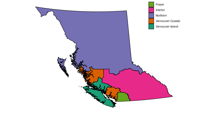
See this DataBC page for the original map data, and this BC government page for more detailed maps. The above map contains information licensed under the Open Government Licence – British Columbia.
We can take the cumulative number of cases in BC and split them up into the regions they were detected in. This information has been included in almost all press releases to date, where there are gaps we can perform linear interpolations to give us a continuous set of curves:
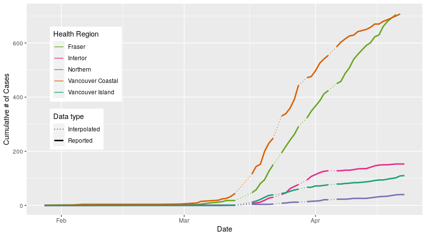
We can see a couple of things happening in this figure. First, most of the cases to date have been in the Fraser and Vancouver Coastal regions (the most recent data points for these two regions are much higher than for the other regions). The other thing that we can see is that these two regions also have steeper accumulation curves; more new cases are being found there than in the other three regions.
But recall that these curves show the total number of cases as a function of date; we know from our last post that people have been recovering and there have also been deaths, but we didn’t look at where they are recovering or where they are dying. The daily press releases don’t give us that detailed a breakdown, but the BC CDC also releases surveillance summaries that do give us more fine-grained information about what is happening in each health region. From these reports we can calculate the number of active cases in each region as the cumulative number of cases minus the cumulative number of recoveries and deaths.
The first report was issued on March 23 and they haven’t been released every day, so there will be gaps in the data available, but like in the last graph, we can linearly interpolate the missing data to give us continuous curves:
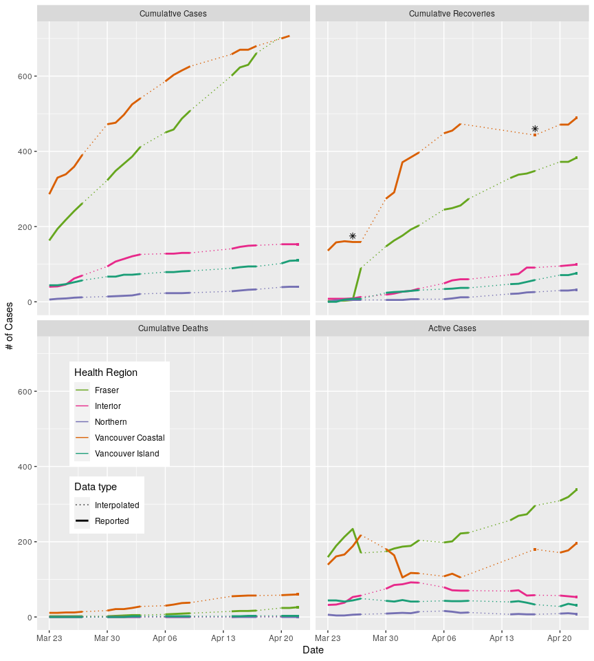 *I said in my last post that recovery curves will only ever go up because they are cumulative, but there are two spots on the Vancouver Coastal curve marked with asterisks where it dipped. Why is that? When we look at the information included in the reports we can see that in the first instance, March 25-26, someone was thought to be sick with Covid-19 but later found to have influenza, so the subsequent data is corrected to account for that. The second instance is due to a change in defintions. Prior to April 8th, VCH numbers were "determined by an algorithm that counted all cases who had passed 10 days since their onset". After April 8, VCH started using the provincial definition of recovery, which requires either "2 lab confirmed negative swabs 24 hours apart OR at least 10 days have passed since symptom onset AND symptoms have improved". So some people who were considered recovered prior to April 8th under the old criteria were no longer considered recovered under the new criteria, hence the number of recoveries went down.
The top left panel is just the cumulative number of cases, like in our first figure. The top right panel shows the cumulative number of recoveries. The bottom left panel shows the cumulative number of deaths in each region. I’ve chosen to plot cumulative cases, recoveries and deaths using the same vertical scaling which means that it’s hard to see what’s happening in the deaths panel, especially for the Northern, Interior and Vancouver Island regions; they have had 0, 1, and 3 deaths respectively. As per the BC CDC summary reports, this data may be incomplete or out of date due to the timing and process for case status updates, but we will work with this data assuming it is reasonably accurate.
Taken together, those three panels allow us to calculate the bottom right panel, the number of active cases in each region. But before we start to intepret this last panel, we need to standardize the data by the populations of these 5 regions. Why? Because if we don’t have some idea of how many people could be infected in each region, then the figure as it is is quite meaningless. Imagine if there were only 100 people living in the Interior region; that would mean that just about everyone in that region was sick, at the same time, around April 1. This would be a phenomenally bad thing, but we woudln’t know that from the above graph, and we might think the situation is worse in the Fraser and Vancouver Health regions that day because there were more sick people there. If we want to compare how the regions are doing, we need to know how many active cases there are relative to the population size. So let’s explore that. How many people live in each region?
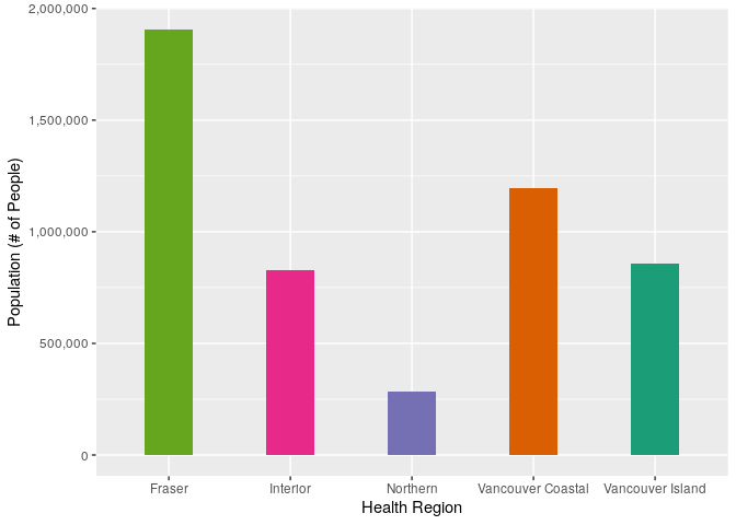
As we might have guessed, the regions don’t all have the same number of people living in them; the Fraser region has the largest population, followed by the Vancouver Coastal region. So what happens when we standardize the active number of cases for each region by their population? How many cases per 100,000 people does each region have:
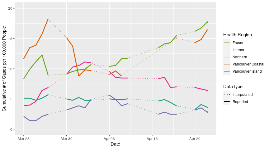
Now that’s we’ve standardized the data by population size, we can see that the regions don’t differ quite as much as much as we might have thought. Uncorrected active cases in the Fraser region was over 30 times higher than in the Northern region, but when we correct for population size, it’s only about 5-6 times higher, which isn’t trivial but is also not as severe a disparity.
We can see quite clearly that active cases ballooned in the Fraser and Vancouver Coastal regions in late March, getting as high as ~18 cases per 100,000 people in Vancouver Coastal before dropping down to around 10 cases per 100,000. Since then, both Fraser and Vancouver Coastal regions have slowly risen to 17-18 cases per 100,000 people. The Interior region saw slower growth in late March and early April, exceeding both the Fraser and Vancouver Coastal regions around April 1, but has since managed to bring their caseload down to around 7 cases per 100,000. Northern and Vancouver Island regions have remained pretty stable, around 3-5 cases per 100,000 people, throughout late March and into April.
So what does this mean? While we may be experiencing a province-wide “flattening” of the curve, clearly some regions are doing better than others, and the two regions with the most people, Fraser and Vancouver Coastal, aren’t doing well. This further emphasizes the messaging we’ve continued to recieve from Dr. Bonnie Henry and Minister Adrien Dix; staying home, practicing social distancing and self isolation, avoiding non-essential travel, washing hands, wearing masks, etc. are still critically important because this pandemic is far from over.
All analyses performed in R V3.6.3