Published: May 22, 2020 by Petra
This post we’re going to focus on the condition of patients infected with Covid-19; specifically, how many people are hospitalized, and of those, how many are in intensive care units. We can start loking at these numbers at the province level, and then look at health regions.
Lets start with a recap of the current numbers at the province scale, using data from the daily press releases:
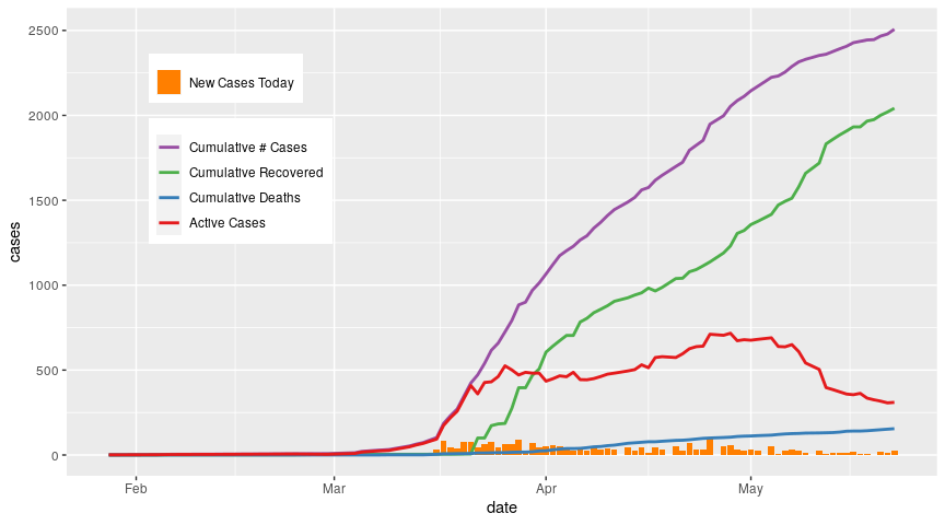
While the number of cumulative cases continues to grow, the number of active cases has levelled off and started to decline since late April, primarily due an uptick in recoveries. Deaths continue to occur but the rate is low relative to recoveried.
Now lets zoom in on the active cases. How many of those active cases are in hospital? And of those in hospital, how many are in critical care (ICU)? We’ll use the data from the BC CDC Covid-19 summary reports. According to the BC CDC summary reports on Covid-19, critical care includes intensive care units, high acuity units, and other surge critical care spaces.
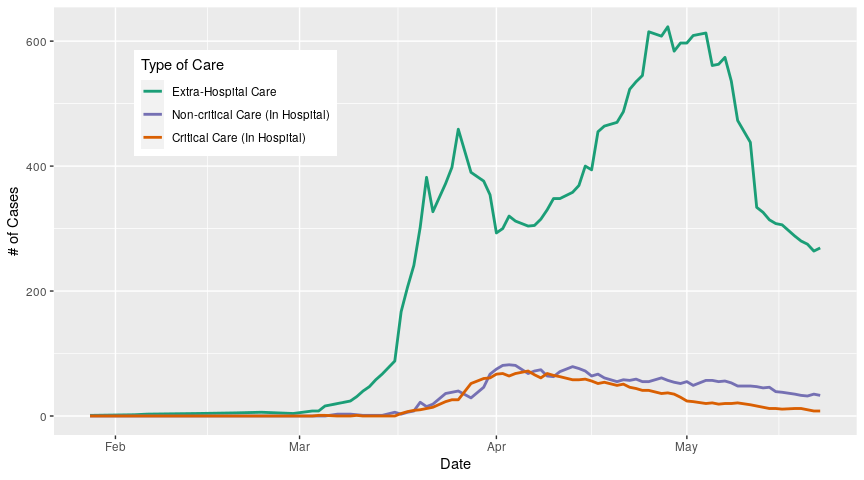
The majority of active cases are being treated outside the hospital (extra-hospital care*), and we can see that this number has flutuated dramatically over the course of the outbreak. One thing to emphasize here is that the number of active cases at any one time is just the number of cases that we know about; there have been reports from all over the world suggesting that some people may become infected and develop symptoms so mild they don’t notice them, or they don’t develop symptoms at all. Under current BC testing guidelines, people without symptoms aren’t going to be tested, so the number of people who carry the virus is likely larger than the numbers presented here. In addition, the number of cases that we know about is going to be dependent on the rate at which we test, which is something we will discuss in a later post.
Moving on, we can see that hospitalizations, both critical and non-critical, peak in early April; the number of patients in critical care has declined since then, as has non-critical patients but at a slower rate. Before we explore why these numbers are dropping, lets look at the regional breakdown in hospitalizations.
We have two choices here; we can either compare the number of extra-hospital cases, critical care cases, and non-critical care cases between regions, or within regions. Let me explain with examples. First, let’s look at the numbers between regions; we do this by plotting the three care categories separately, and colour-coding our curves by region:
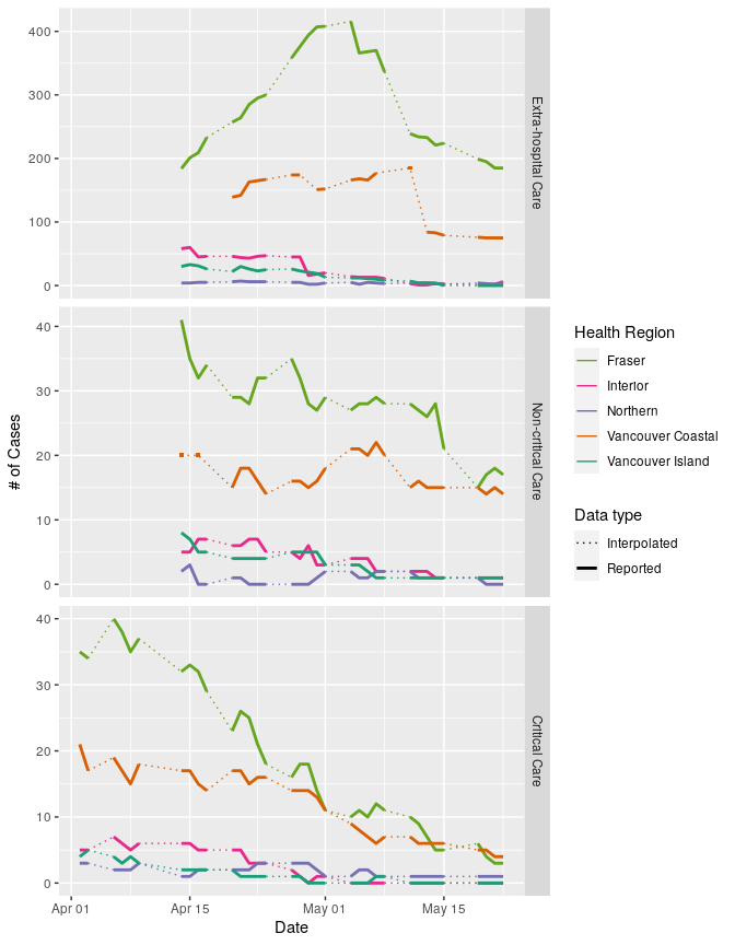
It’s critical to note here that I haven’t standardized the case numbers by the population size in each region, because at the moment, I want to see how each region contributes to the provincial total. In addition, the vertical axis of each panel has a different scale; this allows us to see differences between regions in each panel, but makes comparisons across panels difficult. So lets focus on each panel. We can see that the number of people in extra-hospital care is highest in the Fraser Health region, and has been for as long as we have data (mid-April onwards). Vancouver Coastal records are less complete; we have large gaps that make it challenging to understand what is happening in this region, but we can tentatively say that it looks like the number of extra-hospital cases is dropping towards mid-May. The remaining three regions have seen a steady decline in extra-hospital care cases. So if we think about the provincial trends, we can infer that the big spike in extra-hospital cases over the month of April is largely driven by cases in the Fraser region, and the decline starting in May is also due to Fraser numbers.
What about non-critical care numbers? Again, Fraser Health has the highest numbers for the entire period for which we have data, and has seen a pretty gradual decline. Vancouver coastal has seen some growth in its numbers in early May but has since declined. Vancouver island and Interior regions have seen slow declines over the period, while the norther region has seen a slight bump. So again, provincial trends are primarily driven by whats happening in the Fraser Health region.
Lastly lets look at critical care cases. The northern region has had relatively stable numbers, but the other four regions have all seen declines. Again, Fraser Health has seen the largest decline, but as of May 13th no longer has the most critical-care patiens (now Vancouver Coastal does). All in all this is pretty good news; numbers are going down in almost all treatment categories in all regions.
Now lets look at how case categories compare within regions:
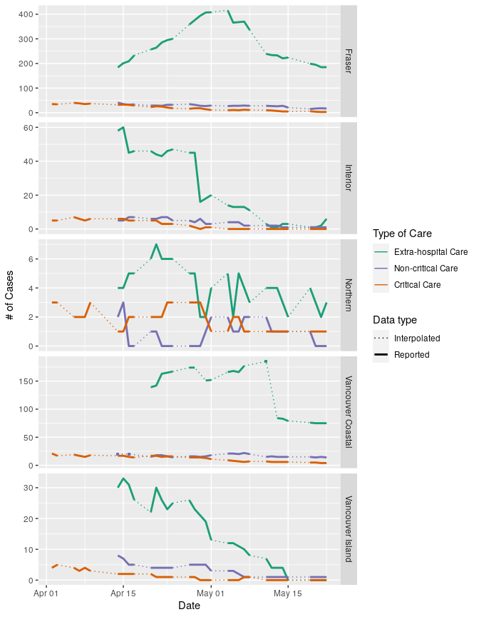
Again, vertical axes are not the same for each panel. Plotted this way, we can see that in the Fraser and Vancouver Coastal regions, the number of cases being treated in hospital are the minority; most people who test positive in these regions are being supported outside of the hospital. In the Interior and Vancouver Island regions this was also the case in mid-April but extra-hospital case numbers have dropped such that all three care categories are similar (<10 cases in each category). The Northern region, which has had the fewest cases to date out of all the region, has also had the largest ratio of hospitalized-to-non-hospitalized cases; that is, extra-hospital cases don’t make up the majority of cases in this region. Numbers have been very low in this region in general, so it’s difficult to say if this pattern of hospitalization is a statisticl artifact or indicative of a real difference between the Northern region and the other regions.
Now we can standardize regional cases by regional population sizes to get a better idea of how the regions are faring relative to each other. We divide the raw number of cases by the population sizes in each region and multiply by 100,000 to obtain the number of cases per 100,000 people.
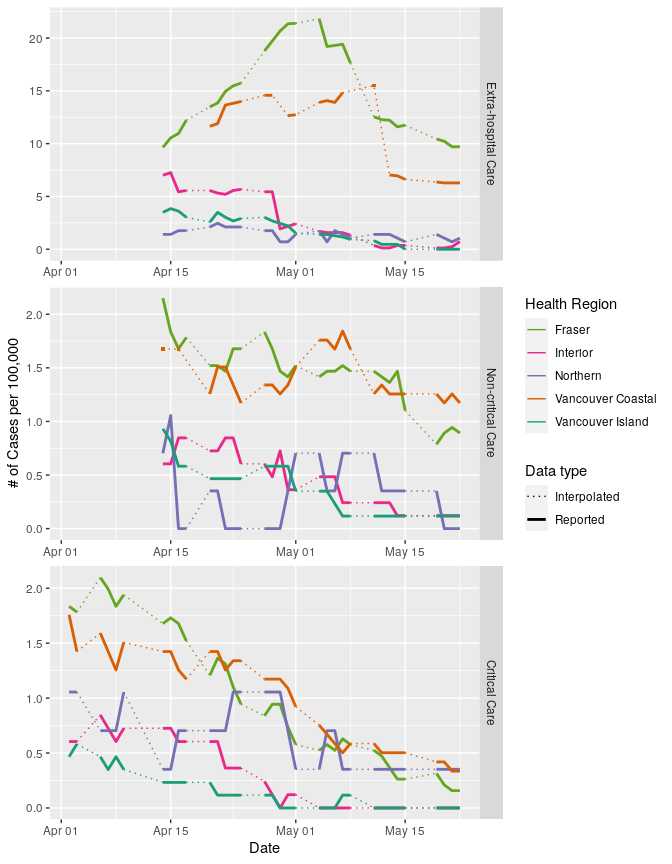
Plotted this way, we can see that though the Fraser region has tended to contribute the most cases to the provincial totals in all three care categories, it’s in a pretty similar boat to Vancouver Coastal when we think about hospitalized cases per 100,000 people. When we look at the number of people in critical care, we see even less of a spread between regions, especially in May. So while the Fraser region is clearly driving a lot of the province-scale patterns that we’re seeing, it’s not that much of an outlier when we standardize case numbers.
*I use the term extra-hospital care instead of self-isolation for a number of reasons. First, many of the people with Covid-19 who aren’t ill enough to be hospitalized are still going to require some support and care during their isolation period, from managing symptoms to keeping the fridge stocked and surfaces clean. Second, not all infections in long-term care facilities have resulted in hospitalization; some of those individuals remained in those facilities and would have received care there. Lastly, the response of BC Corrections to outbreaks in correctional facilities hasn’t been very clear; we know some inmates have been hospitalized, others have been placed in isolation within the correctional facilities, and some have been released early as a preventative measure. I don’t think its appropriate to say that inmates self-isolated when they have little control over how the outbreaks are handled or what they can do about it.
*Edited May 24 2020 to include reported values in plots 2, 3, and 4 that were originally not showing due to plotting conventions (points do not appear when plotted as part of a line graph, they need to be added as a separate layer). Interpretations remain the same.